Brand Development
Arcadia University Brand Foundation
Brand archetype, positioning, and visual interpretation
Role: Creative Director, Lead Designer
Outcome
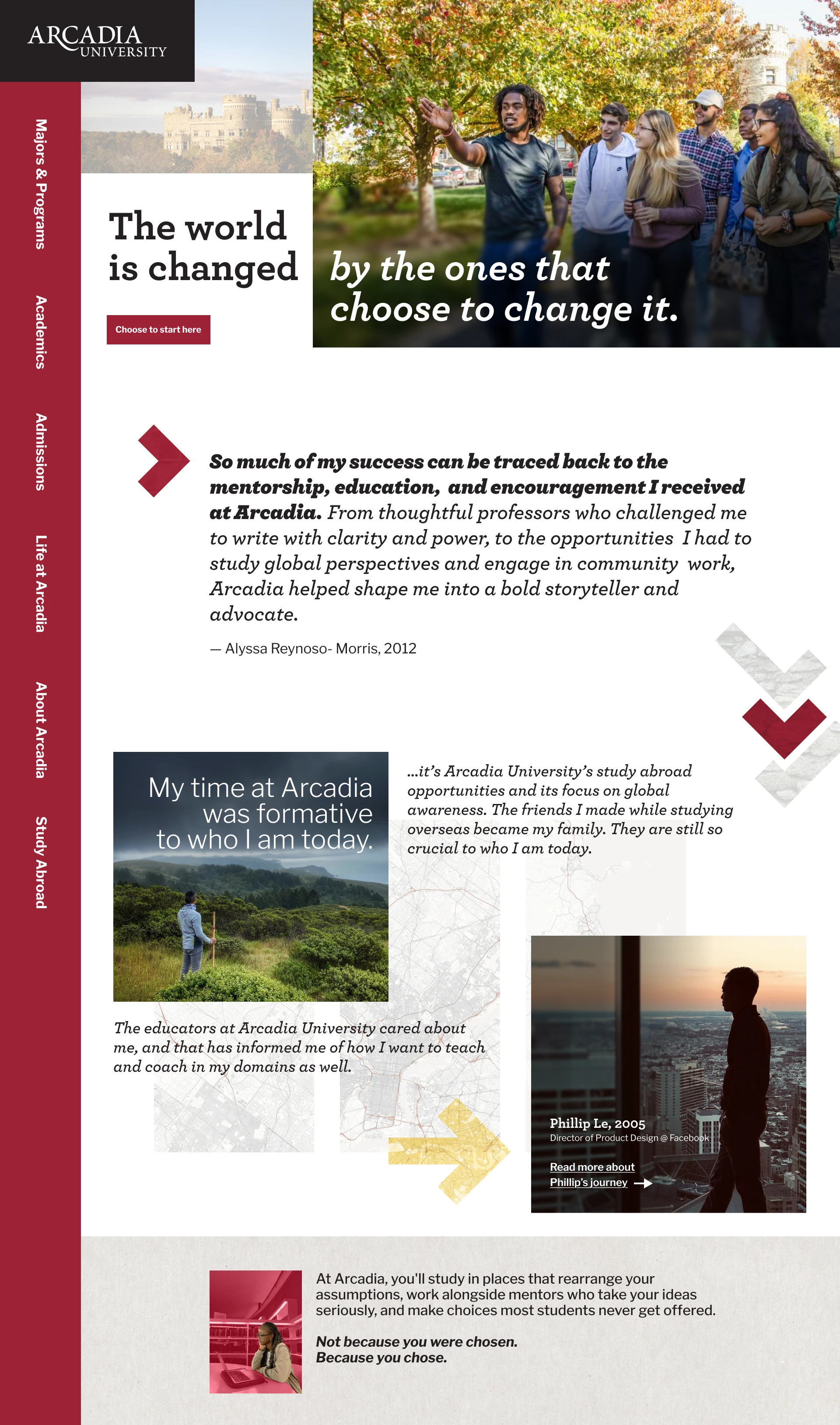
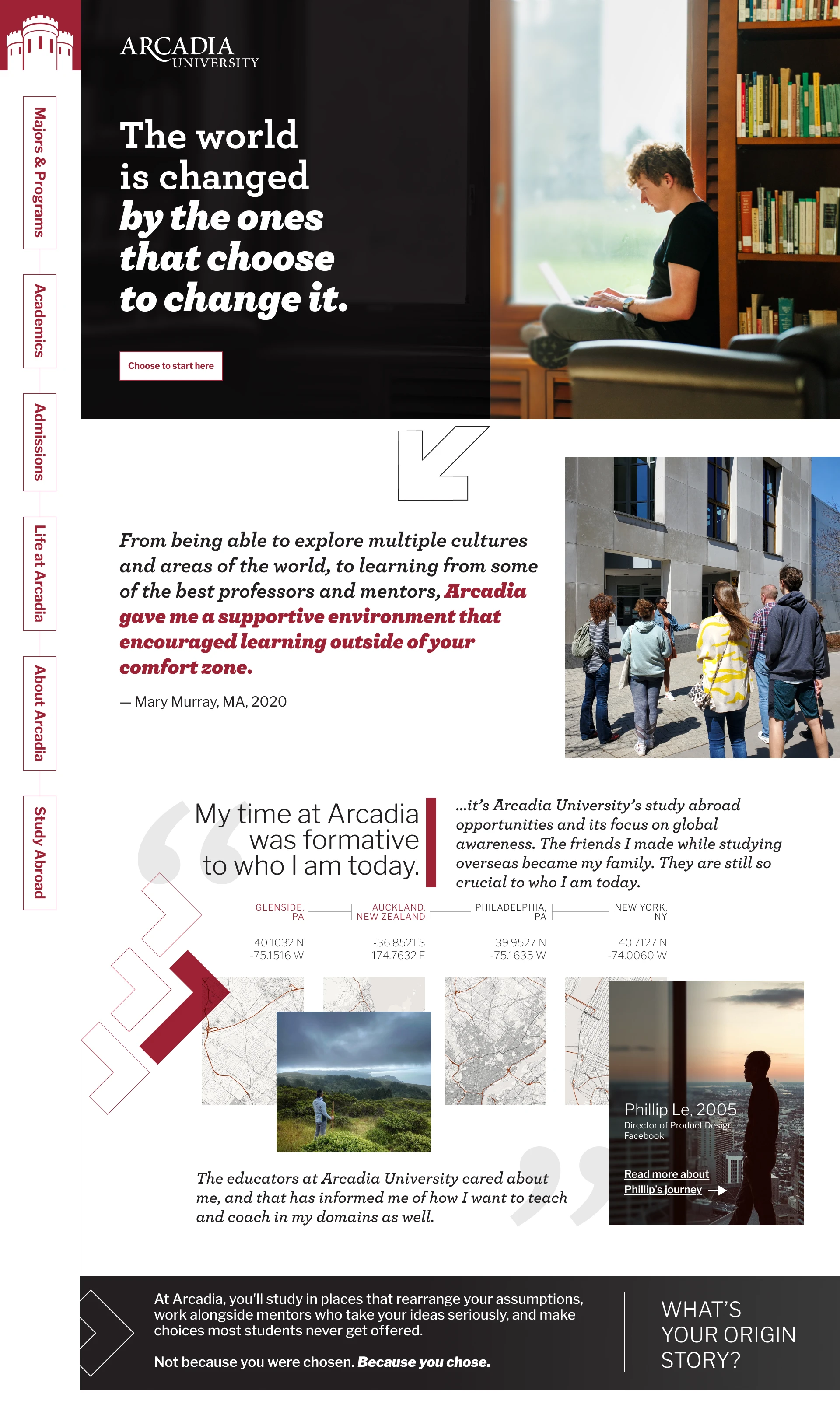
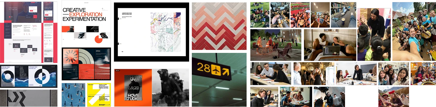
Through research exercises the Arcadia University brand was reimagined into designs fitting the discovered foundational archetypes through numerous brand exercises. The end goal of the project was to interpret the research into a visual direction for Arcadia's marketing department, illustrating how the defined archetypes could be presented when rooted in a solid foundation.
Problem
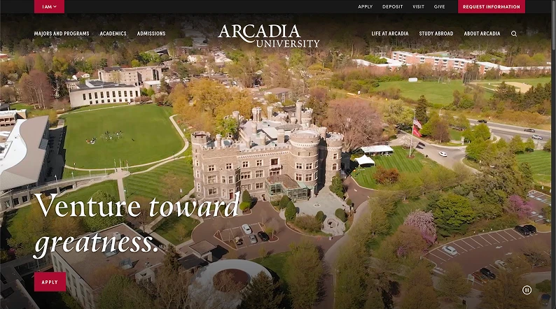
Arcadia University marketing had been driven by a vague sense of self.
The institution's marketing efforts didn't land or resonate fully with prospective students, because it wasn't rooted to a foundational layer.
Approach
Our team led with research to find the foundational layer the brand required. The first step in the project was brand archetyping exercises. 6 cohorts, consisting of staff, leadership, alumni, and current students, were taken through 6 separate brand exercises. Senior cabinet members were then asked to write a post mortem for Arcadia, an exercise with constraints to surface how the school should be remembered to establish its guiding principles. In conjunction with the previous exercise, the senior cabinet members were taken through an exercise to determine Arcadia's unique positioning.
After completion of the brand exercises, a competitive analysis mapping was created with Arcadia's local peer set.
Insight
Belonging and exploration surfaced everywhere, but the competitive read turned two familiar words into a position.
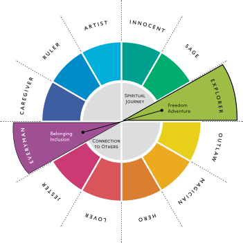
The archetype exercises resulted in Explorer being the primary, and Everyperson being the secondary. Though initially, this appeared to be 2 opposing archetypes sitting on opposing sides of the wheel. Belonging means finding acceptance, building a community. Exploration sets off in discovery of the world. However, in the context of the institution, this positioning was their differentiator.
At Arcadia, everyone is included, creating a local first community. Through support and facilitation, students are enabled to scale this community — regionally, nationally, globally.